The Story
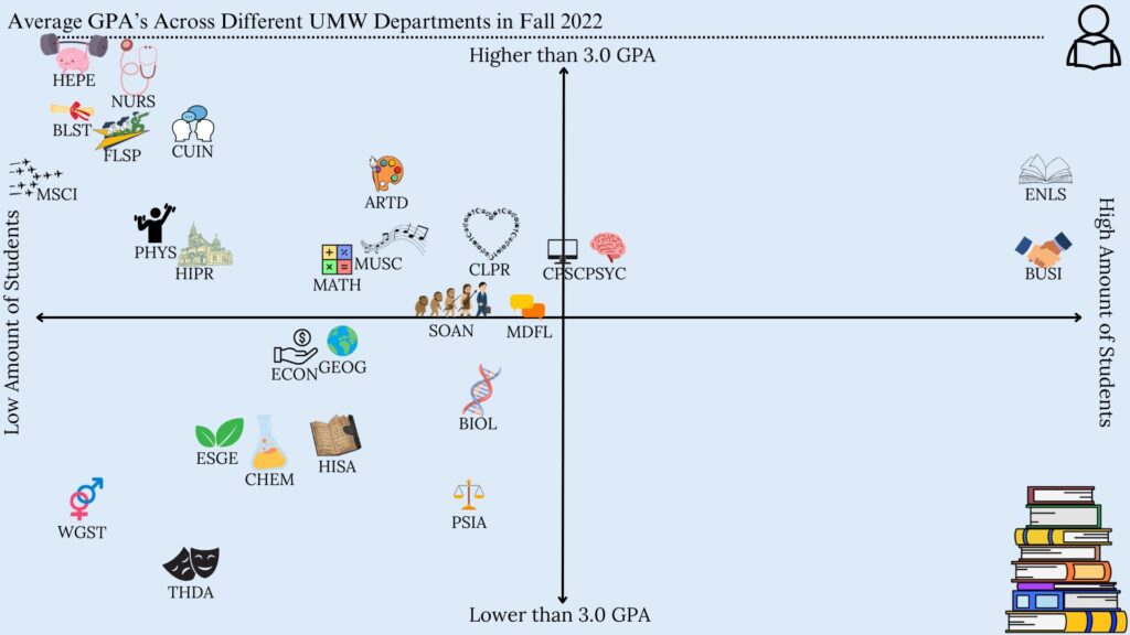
The main story that I could identify through the data is that departments that have a lower amount of people tend to have a higher average GPA in the Fall of 2022. These are the departments such as HEPE, NURS, and BLST. Although there were some outliers, such as ENLS and BUSI, which are possibly the biggest departments at UMW, they still have a higher GPA, but not as high as the departments mentioned before.
The Media
I chose to do an infographic chart that would show specifically where each department at UMW would land in terms of GPA average and the amount of students in each department. I did an x/y-axis sort of graph, where the more you went up the graph, the higher the gpa. As well as the more you went to the right of the graph, the more students that were in each department. This could also help in easily comparing different departments to each other.
The Process
I chose to use Canva in order to create my infographic. Canva is very easy to use, and has many free items to use that helped get my story across. I could easily edit the size, color, as well as the position of the data in the chart. It was also very easy to download as a JPEG in order to upload it to anywhere I want.
Credits
I found the data that I used on the UMW’s site for Institutional Analysis and Effectiveness and I used the 2022-2023 Grade Distribution Summary. I only used elements in Canva in order to create the infographic chart. Any extra clip-arts were also found on Canva, such as the student symbol in the corner and the stack of books.
Leave a Reply